Branding & Tradeshow Design

Rebranding with a deadline.

Client

A high security data center, Onramp

Challenge

Onramp needed a refreshed brand presence to introduce a new certification at an upcoming tradeshow. To control costs, we kept the existing logo but developed a new website, tradeshow booth design, updated marketing collateral, and branded apparel for the sales team.

Results

Feedback from the sales team indicated that they were getting more attention at tradeshows and were having more productive conversation with potential clients.

My Role

Design for the tradeshow booth, marketing collateral, branded apparel.
An outside agency built the website because of the tight deadline.

Trade show booth graphic for OnRamp featuring the company logo, tagline 'Secure | Hybrid | Computing,' and services 'Compliance & Security, Cloud & Hosting, Colocation.' The design includes flowing green and blue wave lines with icons representing data centers, HITRUST certification, and cloud security.

Tradeshow Booth

The booth design built on a modernization I had completed the previous year, when I introduced a lighter, backlit display. For this rebrand, I expanded on that organic, airy aesthetic with updated colors, fonts, and the newly required HITRUST logo. Because the certification’s brand standards emphasized red, I incorporated that color prominently to highlight the new offering.

Custom blue blazer design featuring OnRamp and HITRUST logos shown as a digital mockup on the left and modeled by two men wearing the jackets on the right.

Custom Jackets

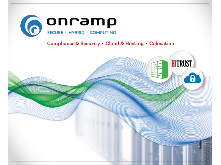
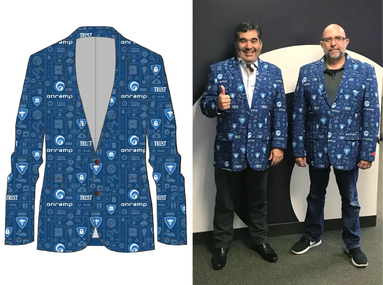
For apparel, the team initially wore gray logo polos I had designed prior to the rebrand. Feedback from staff made it clear they wanted something more eye-catching for the busy tradeshow floor—one even joked about wanting “racecar driver coverage” of logos. We landed on a logo-patterned blazer. With Lunar New Year factory closures looming, I quickly adapted an in-progress pattern into a repeating design that included service icons, the HITRUST certification, and the company logo. By screening it back as a textured base, the white logos stood out sharply.

Despite the tight timeline, the project was completed within a week, delivering a unified, modern brand presence that elevated both the certification launch and Onramp’s visibility at the tradeshow.

The front page of a case study for an OnRamp customer

Digital & Print Collateral

The organic lines from the tradeshow booth inspired the new design of the collateral. I liked the upward tilt on the ends, which resembles a smile and gives the materials an optimistic, approachable tone. This visual language carried through both print and digital pieces, creating consistency across channels. For the one-page handouts and case studies, I used the curved forms as framing devices, leading the reader’s eye smoothly across the page. The same elements translated well to digital formats such as downloadable guides and PDFs, reinforcing the brand identity while maintaining clarity and readability. The result was a cohesive suite of materials that not only aligned with the refreshed booth design but also projected professionalism, accessibility, and a sense of forward momentum.

10 Critical Questions Whitepaper PDF

Kinesis Case Study PDF

Promotional Video

This video was made to promote OnRamp services. I was used as part of the tradeshow presence and played in the lobbies of the data center locations. I created the motion graphics in Adobe AfterEffects.

Construction Tradeshow Designs

Entrance Displays

Branded graphics for the build Expo tradeshow presence. I used a unifying color scheme for the graphics o give a cohesive look to the marketing presence.

Onramp Signage & Apparel