The organic lines from the logo inspired the new design of the collateral. I liked the upward tilt on the ends, which resembles a smile and gives the materials an optimistic, approachable tone. This visual language carried through both print and digital pieces, creating consistency across channels. For the one-page handouts and case studies, I used the curved forms as framing devices, leading the reader’s eye smoothly across the page. The same elements translated well to digital formats such as downloadable guides and PDFs, reinforcing the brand identity while maintaining clarity and readability. The result was a cohesive suite of materials that not only aligned with the refreshed booth design but also projected professionalism, accessibility, and a sense of forward momentum.
10 Critical Questions Whitepaper PDF
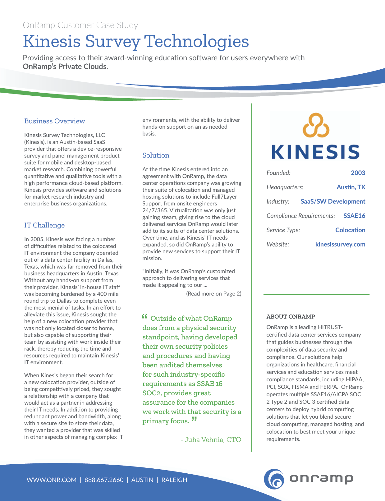
Kinesis Case Study PDF