User Experience & Accessibility
Listening to users
Client
Austin-Bergstrom International Airport
Challenge
We were presented with an open ended challenge to improve accessibility at the Austin airport for a capstone project. They knew that there were additional improvements which were needed in both the physical space and the information on the website.
Results
The airport team began restructuring the information on their website based on our early mockups and later implemented key recommendations, including launching a pilot program of the GoodMaps app and adding a video with ASL interpretation to the website.
My Role
Background research, usability testing, and recruitment
About the
The airport had started efforts to improve services for passengers with mobility challenges because they were getting requests for these services. The information on there website was disorganized and often not very informative. The airport is crowded and an expansion was in the early stages of planning so there wasn’t much space available for additional services. The airport staff that we worked with was aware of some technology that had been installed in part of the airport to assist deaf passengers but didn’t know a lot of details.
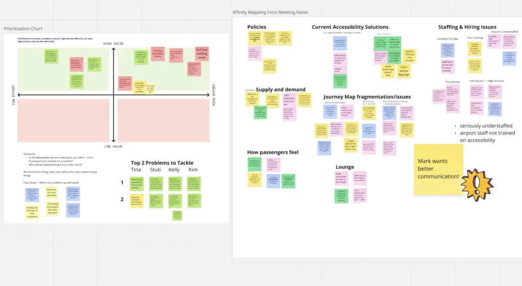
Research
Although the airport’s initial focus was mobility, I sought to expand the lens to include accessibility challenges experienced by blind, deaf, and neurodiverse travelers. My personal connections with individuals in these communities—combined with Austin’s role as home to the Texas School for the Deaf, the Texas School for the Blind and Visually Impaired, and the Criss Cole Rehabilitation Center—made it clear that the airport likely serves a higher-than-average population with diverse accessibility needs.
To better understand the problem, I conducted informal interviews with friends and reviewed blogs and videos created by travelers with disabilities. This research surfaced common pain points and highlighted airports recognized for leading accessibility practices, providing models to learn from.
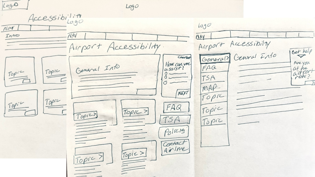
Website Redesign
We decided to work on the website since we were more familiar usability in digital spaces. After we shared an early prototype of the page we noticed that airport staff had already begun to implement some of our suggestions about the organization of topics.
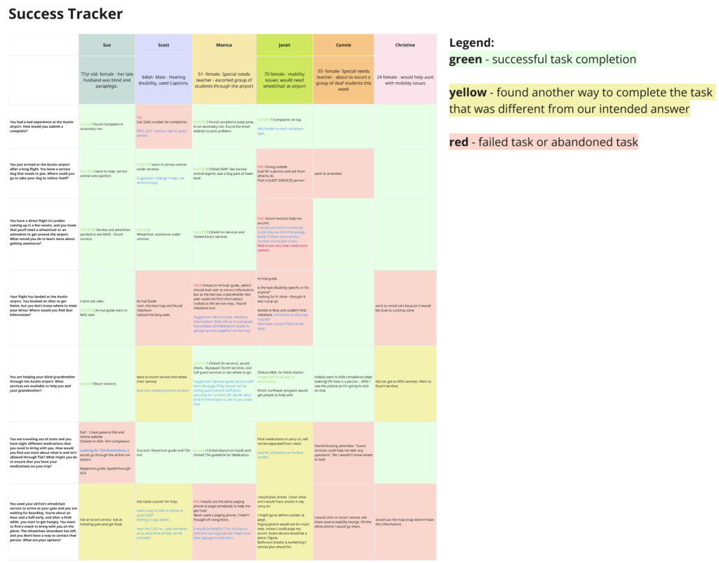
User Testing
Once the prototype was ready, we conducted usability testing. Recruitment proved challenging: without a budget, we wanted to avoid overburdening disability communities, who are often asked to provide free labor. Ultimately, we relied on friends and family as testers, acknowledging the limitation.
The testing confirmed that our design was a clear improvement over the original site. One win was the information structure made it easier to find what the user was looking for. Another win was the use of images to illustrate each service made drew attention and provided redundancy to get the information to users with different accessibility needs.
Design Failures
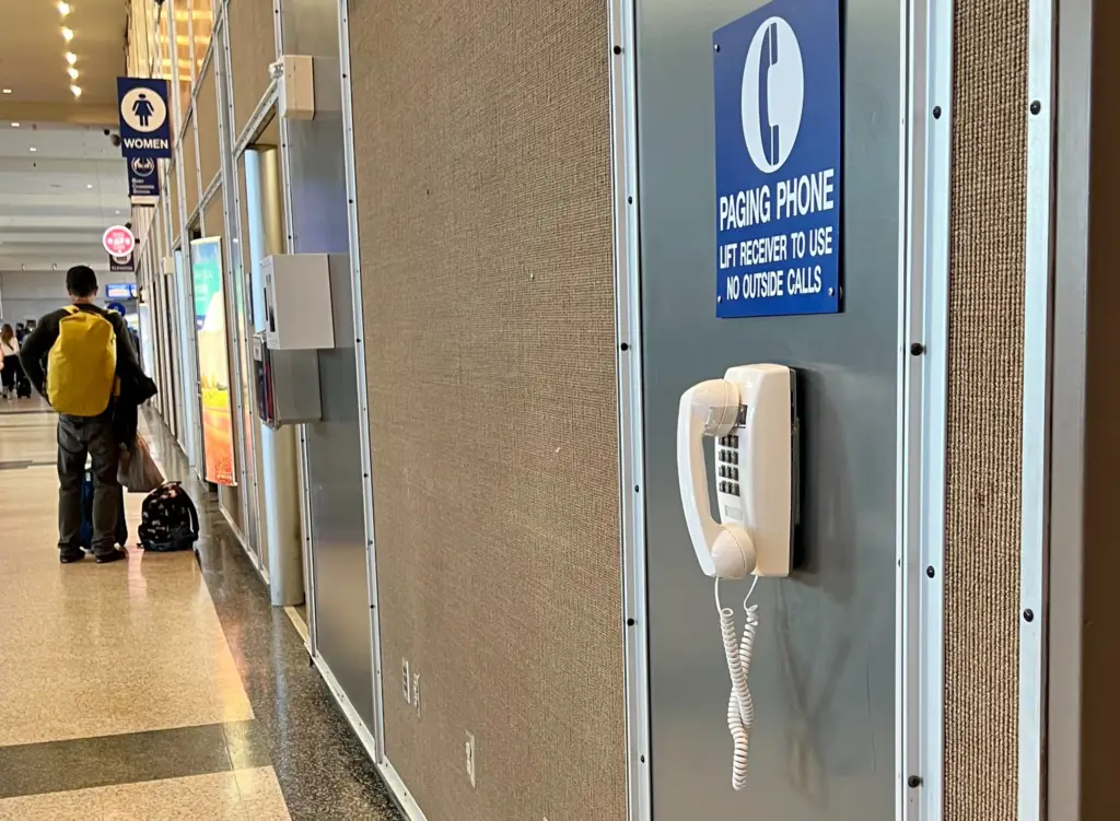
One important failure emerged. We had directed users to the paging phones as a way to request immediate assistance, only to discover that these landline phones were inaccessible to deaf passengers. Based on this finding, we recommended the addition of a texting option for requesting support, ensuring a more inclusive solution.
Phone number…
What am I gonna do with that?
– Deaf user
My Presentation
This recording captures my capstone presentation, where I presented the project to a panel of industry professionals and a live audience.
Changes to the Austin Bergstrom Airport Website
Below are screenshots of the iterations of the airports website before, during, and after the project.
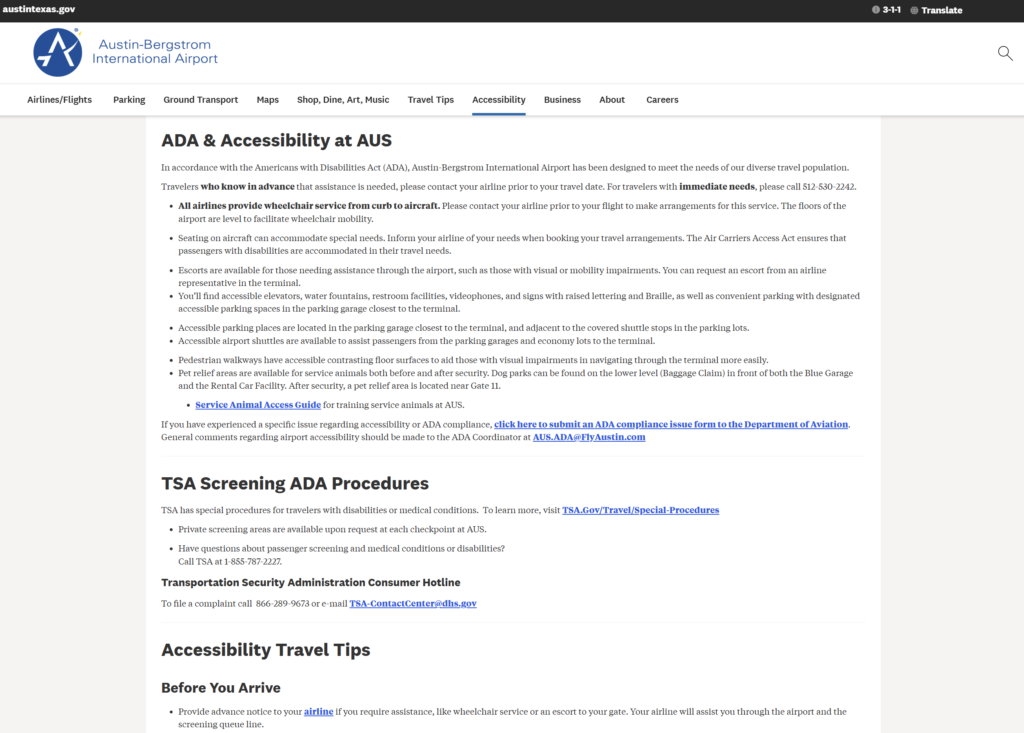
Before the Project
Before the project began, accessibility information on the website was presented primarily as a list of bullet points focused on mobility needs. Information related to vision and hearing accessibility appeared inconsistently across the page. Additional details, such as a new pickup area for passengers using wheelchairs and a vetted assistant service, were located further down on the page and not clearly connected to specific accessibility needs.
Archived version:
https://web.archive.org/web/20221121003448/https://www.austintexas.gov/page/accessibility
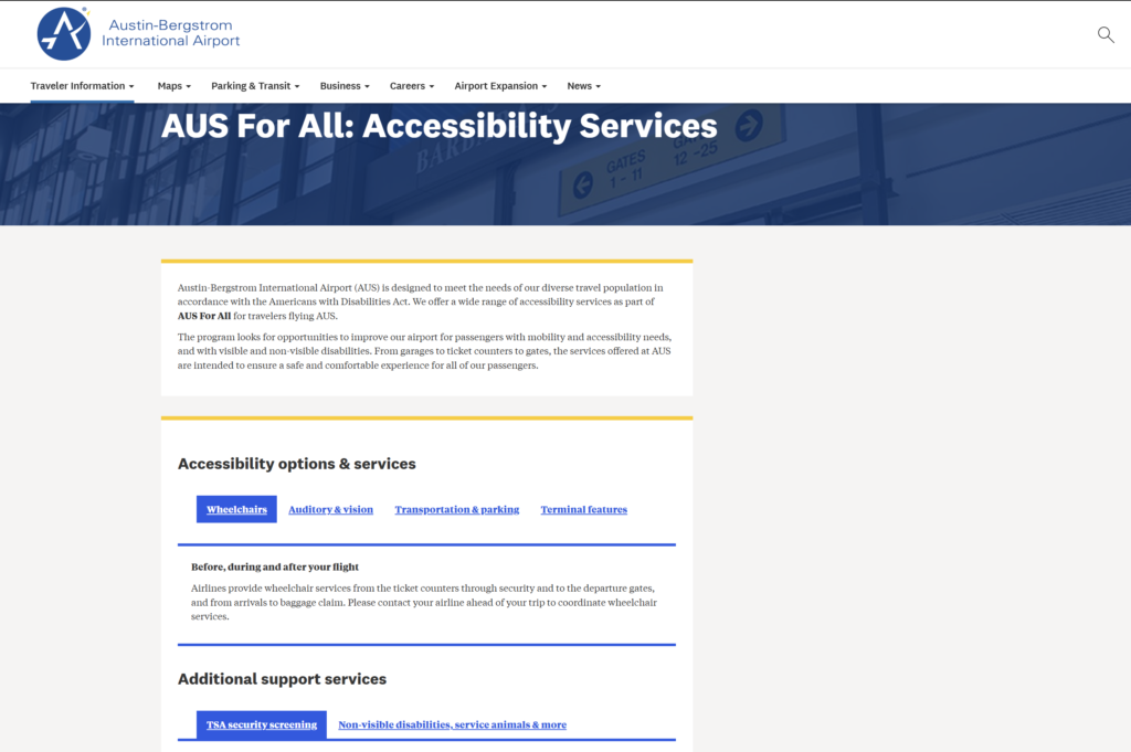
During the Project
Our team recommended reorganizing the services by accessibility need (e.g., mobility, vision, hearing) to better match how users search for information. Before the project concluded, the airport team implemented this recommendation by restructuring the content under tabbed sections organized by accessibility category.
Archived Iteration:
https://web.archive.org/web/20230409063317/https://www.austintexas.gov/department/aus-all-accessibility-services
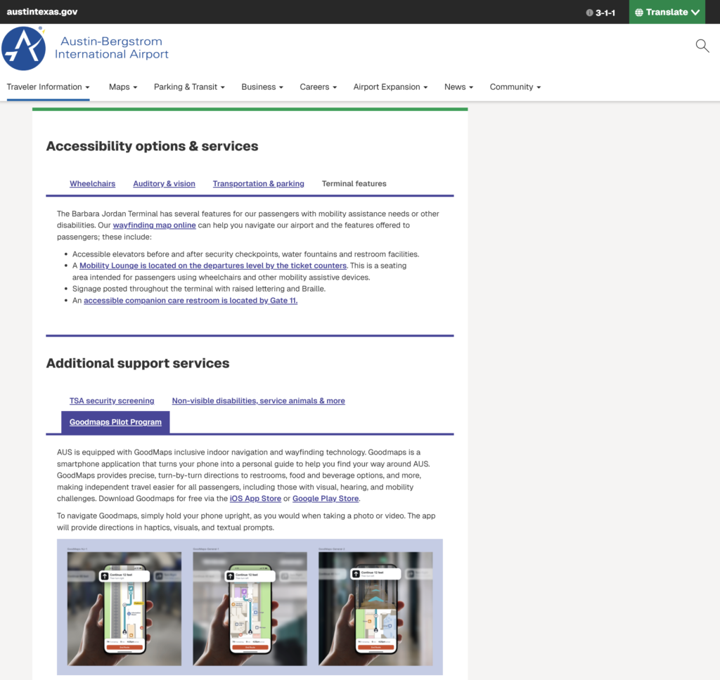
After the Project
Following the project, the airport continued to iterate on the page using our recommendations. Notable improvements include:
- Adding a video at the top of the page explaining available accessibility accommodations.
- Launching a pilot of the GoodMaps indoor navigation app, suggested by a blind participant seeking greater independence
- Highlighting a restroom equipped with a motorized, adult sized changing table that I found labeled in another part of their website.
- Including a traveler rights video with ASL interpretation.